JHL commissioned this project with the intention to bring people with different backgrounds (members of their union) together and have some visual identity that could relate to different cultures being itself an opener of conversation.
They chose 7 languages to start with, identified as the most common mother tongues among their members.
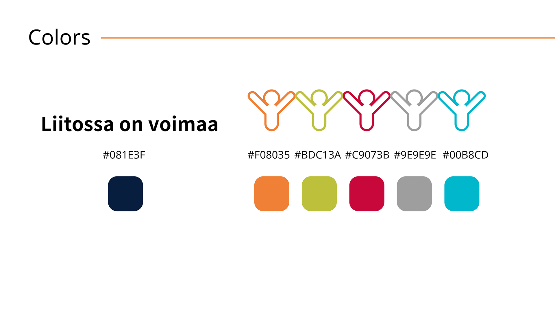
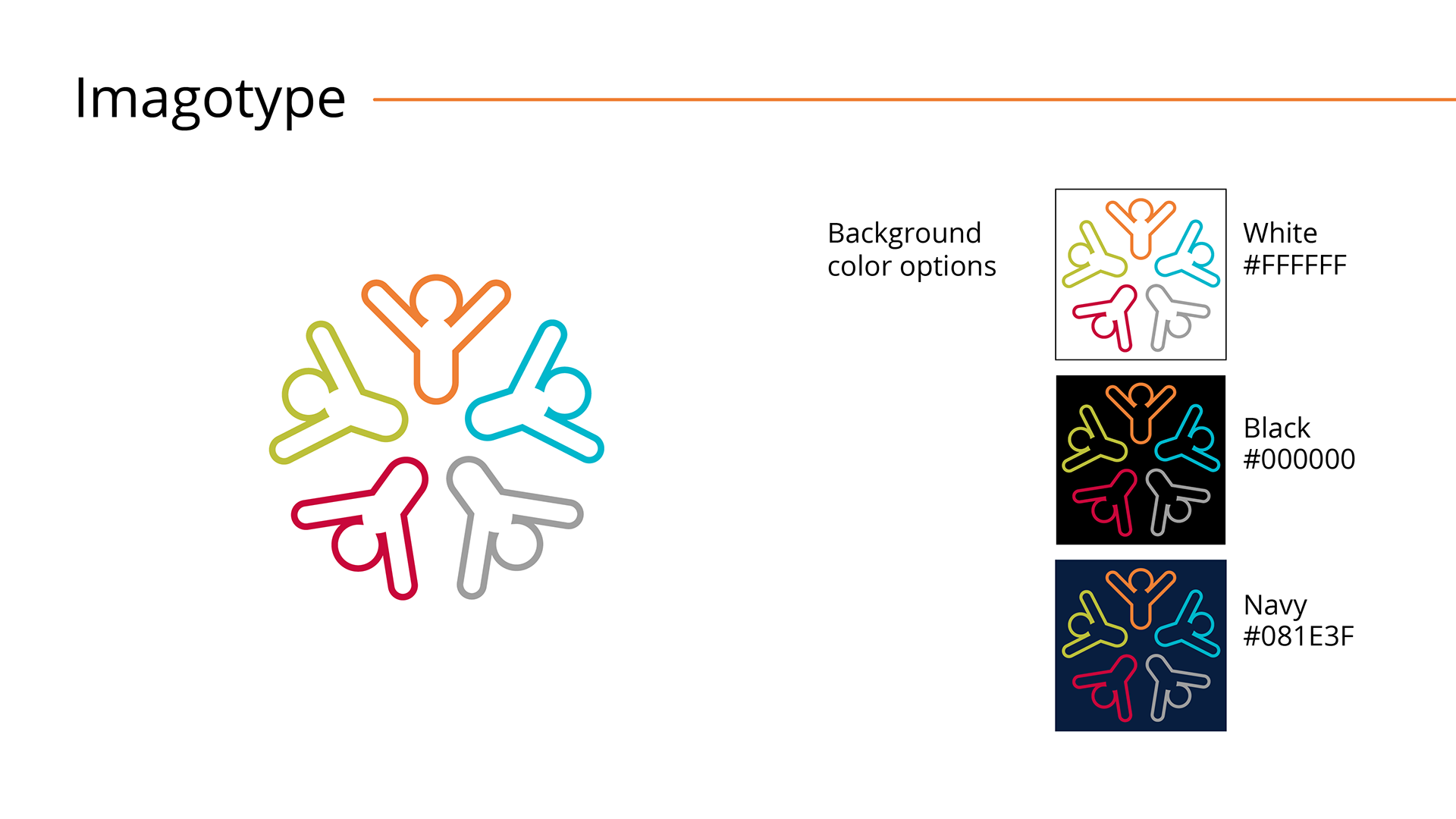
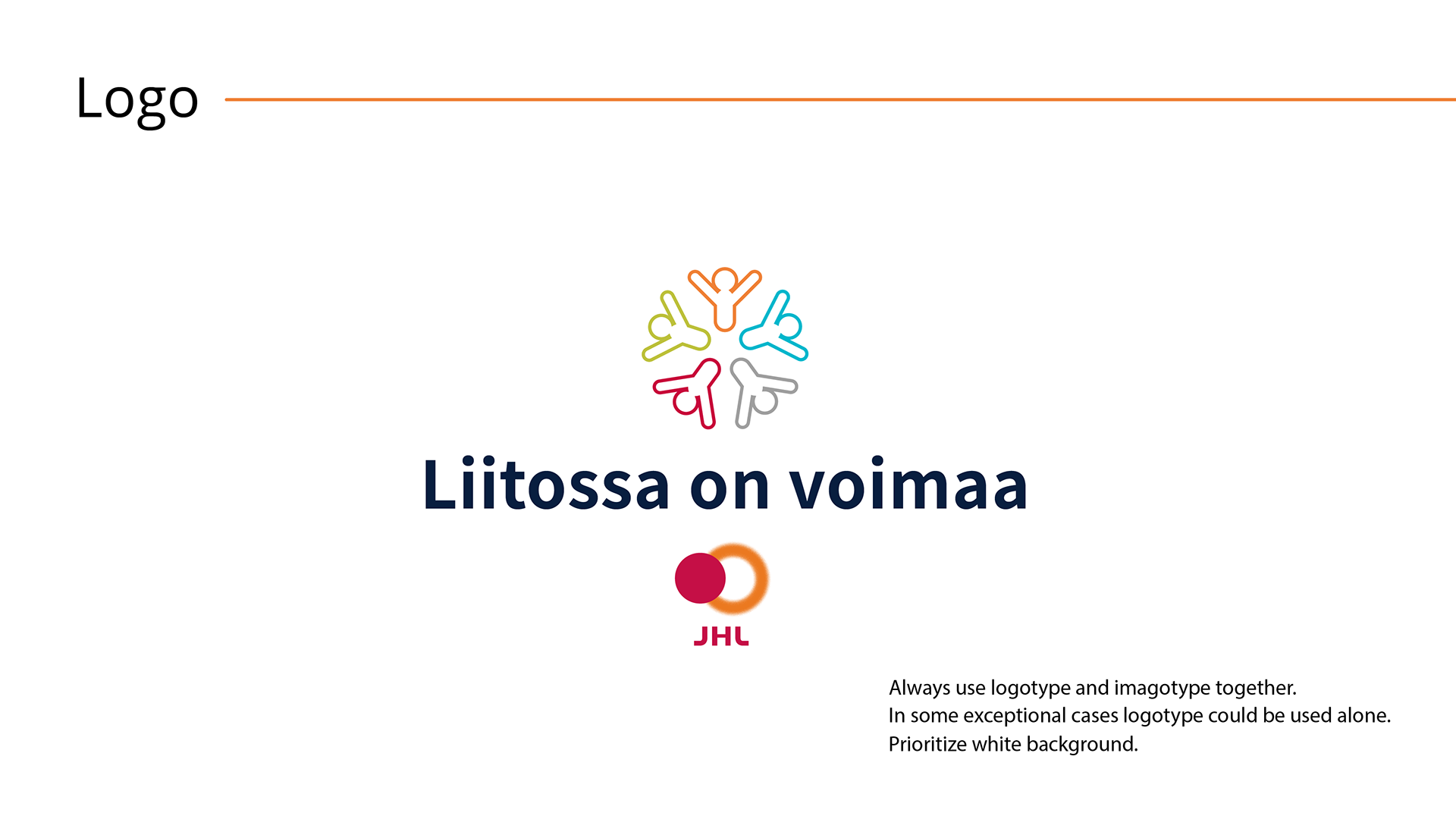
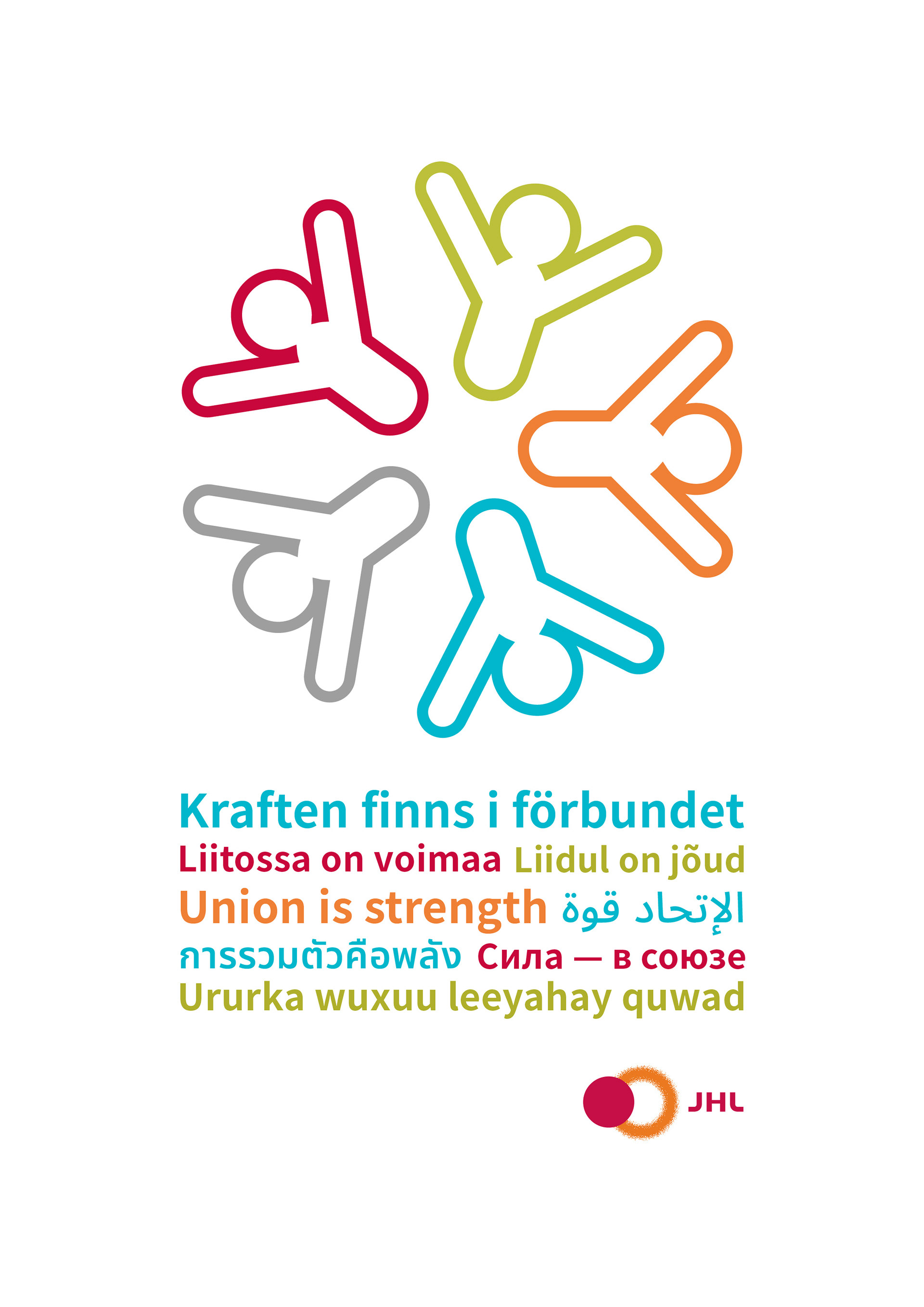
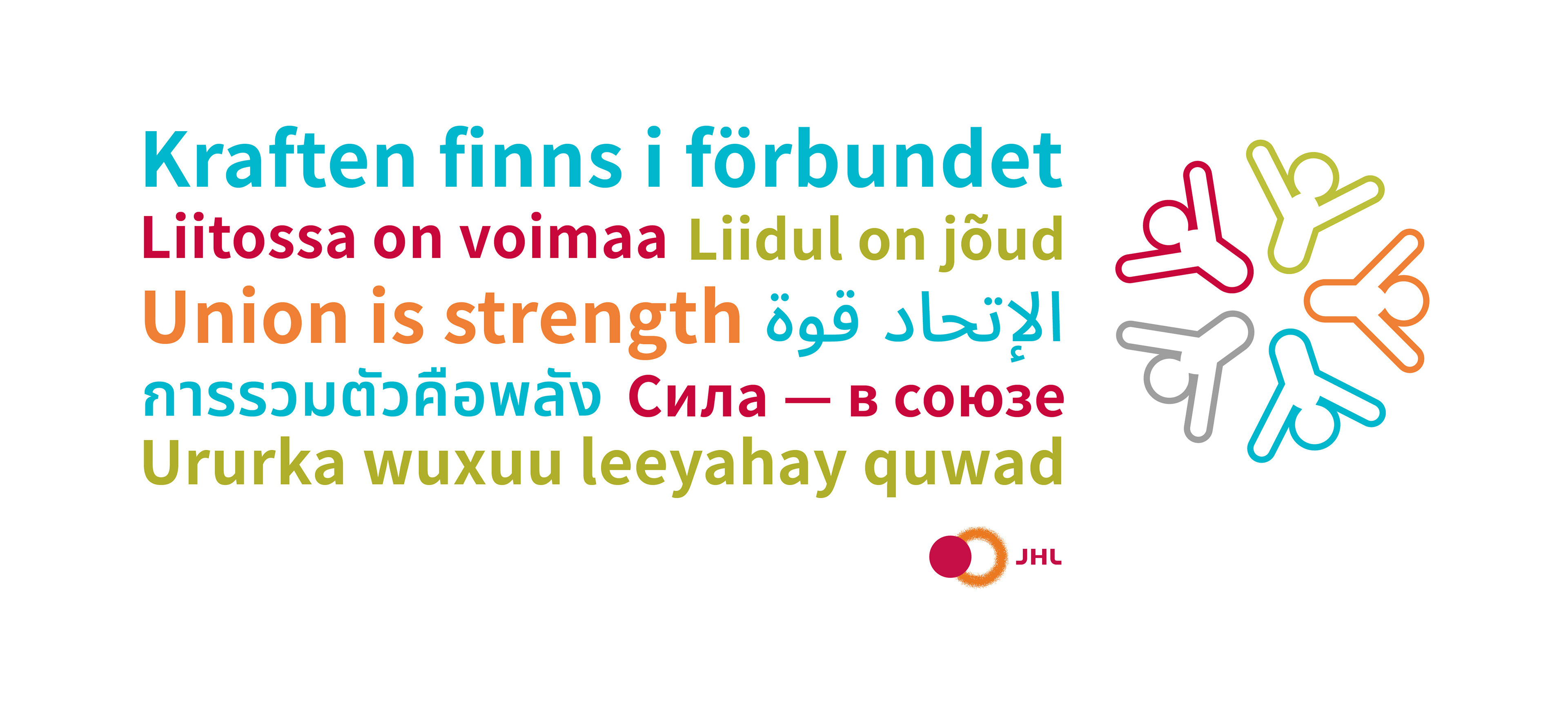
The imagotype (round logo) reflects solidarity, diversity, and playfulness, having 5 people gathered in a circle holding hands.
The imagotype (round logo) reflects solidarity, diversity, and playfulness, having 5 people gathered in a circle holding hands.
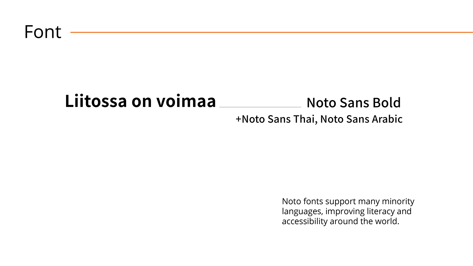
The font Noto Sans was chosen because is simple and accessible for many languages including those with special characters. Easy to scale and replicate in many other languages.
Some of the colors are part of JHL brand identity and a few more were added to complement the scheme having a playful and diverse combination.
Some of the colors are part of JHL brand identity and a few more were added to complement the scheme having a playful and diverse combination.
This visual identity aims to empower people with foreign backgrounds and enable equality and fairness to all the workers of the union. Read more about this initiative here.

Style 1 (Vertical distribution):
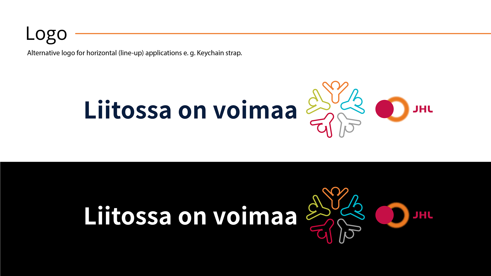
Style 2 (Horizontal distribution):
Use of different languages for the logo:
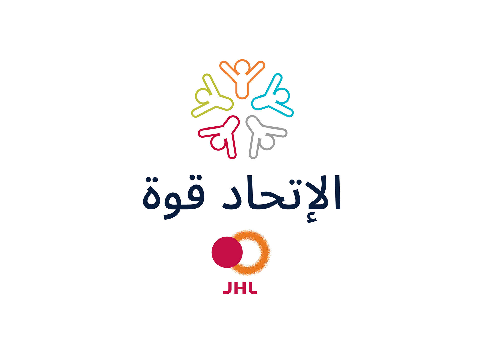
Arabic
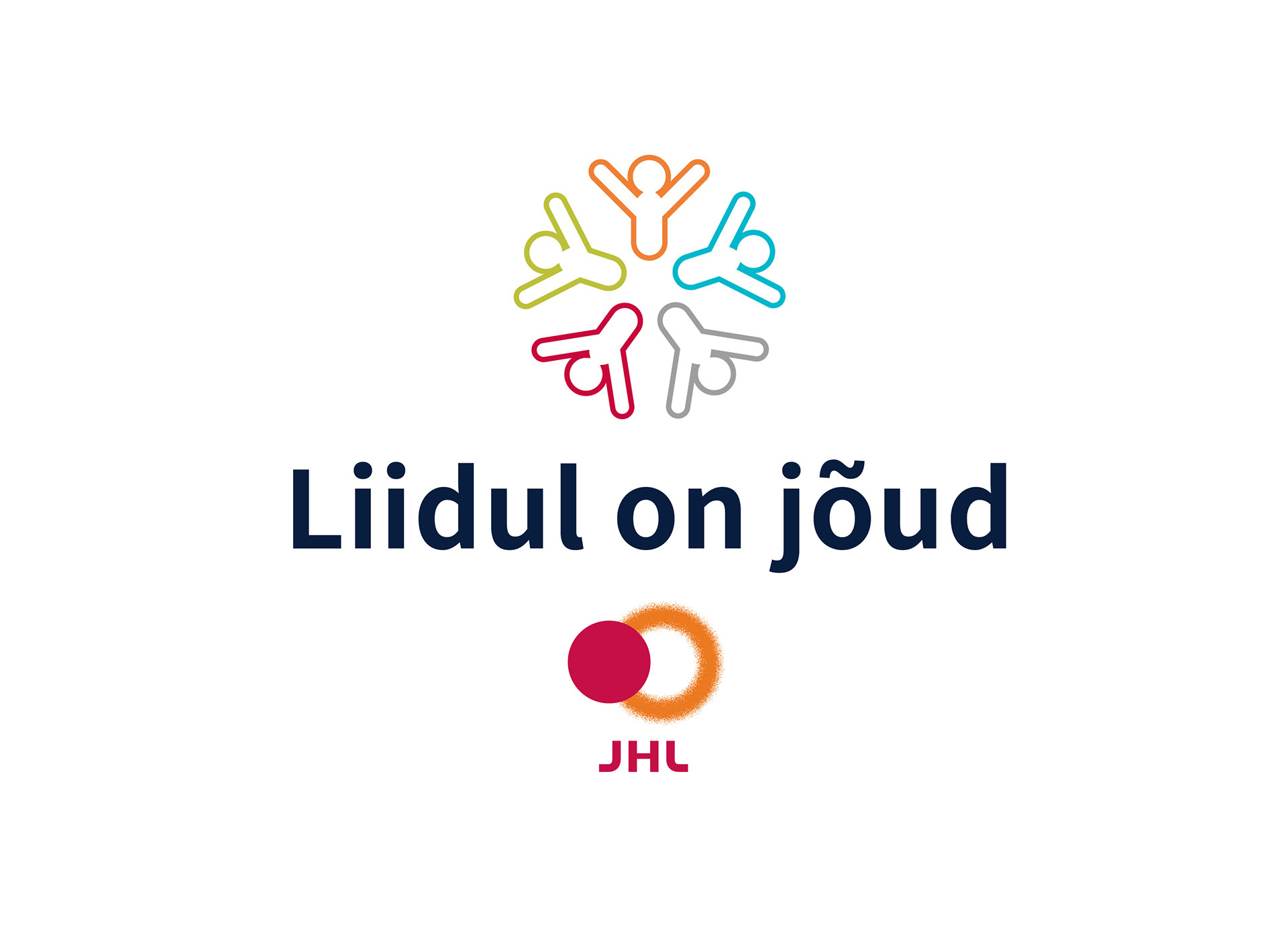
Estonian
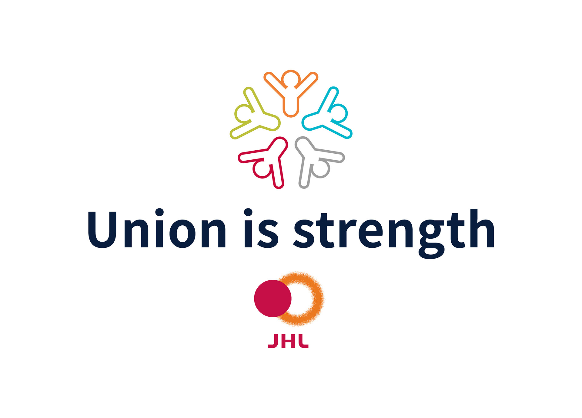
English
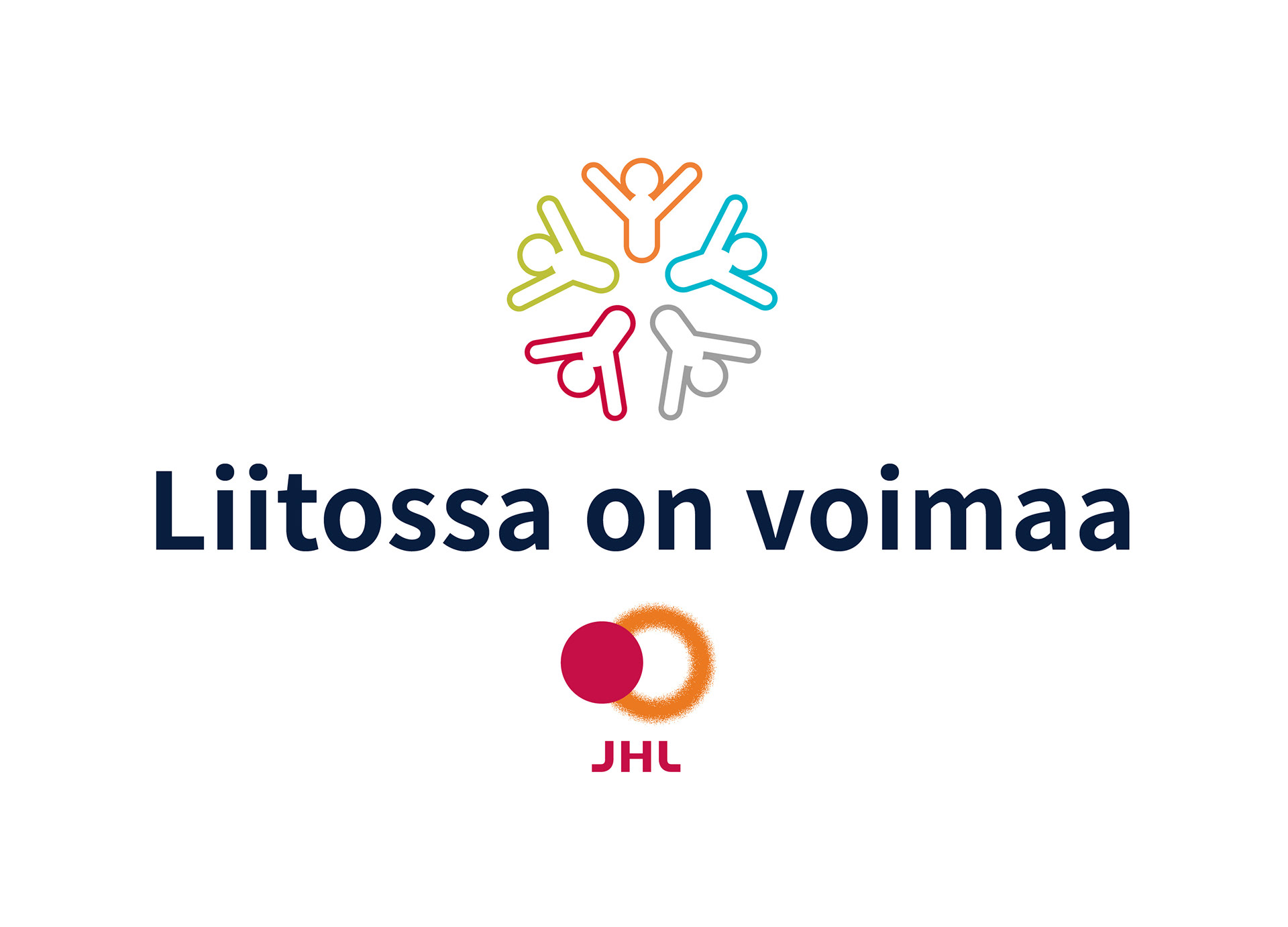
Finnish
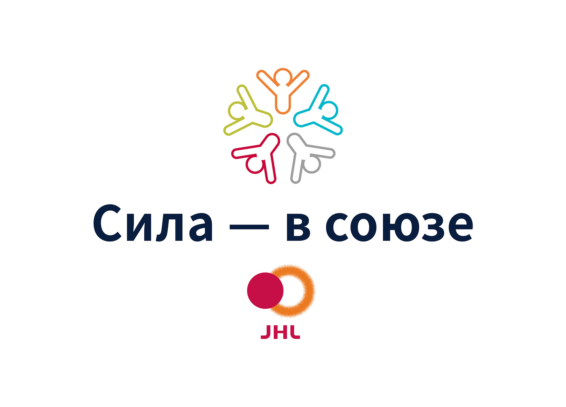
Russian
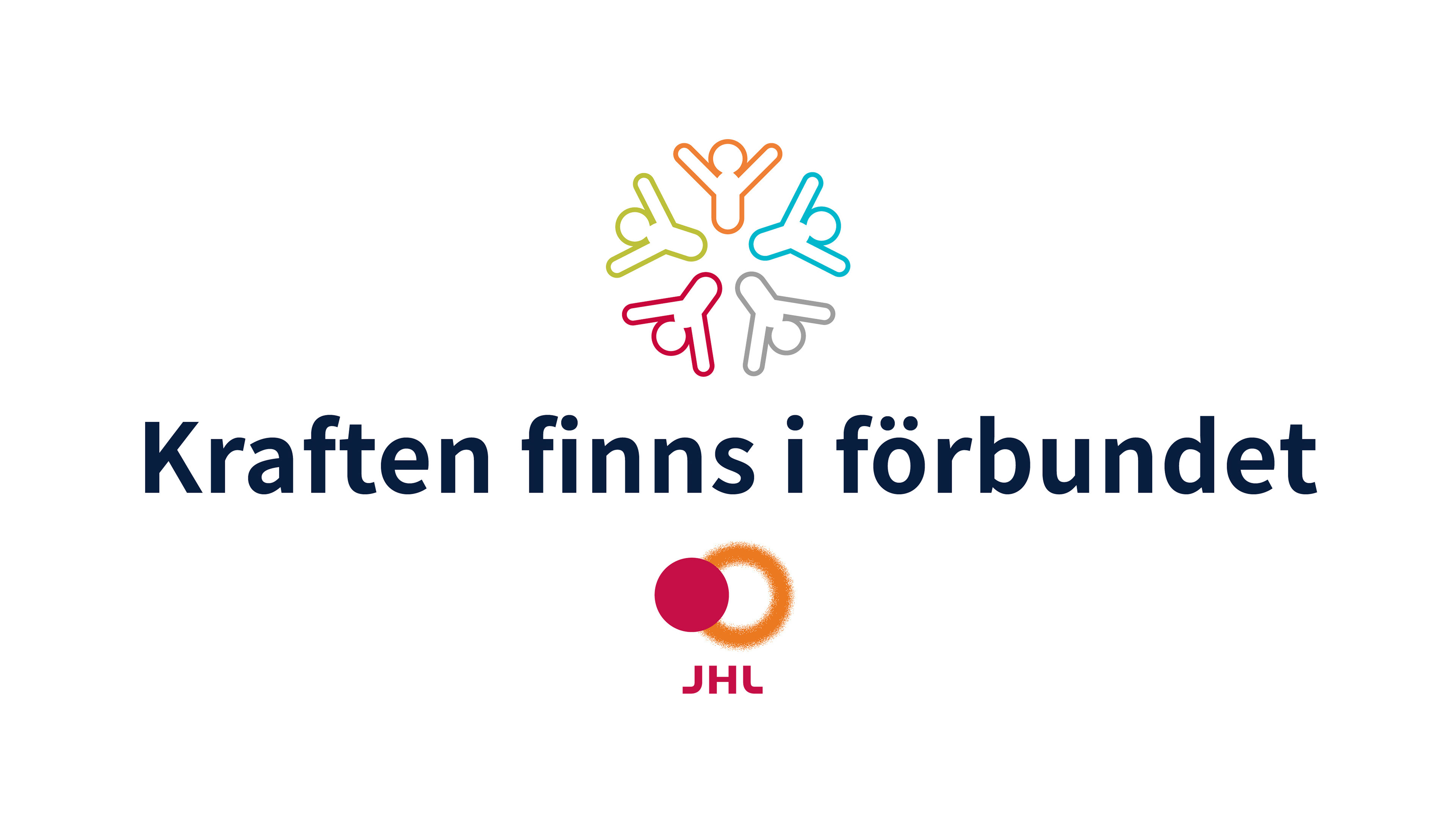
Swedish
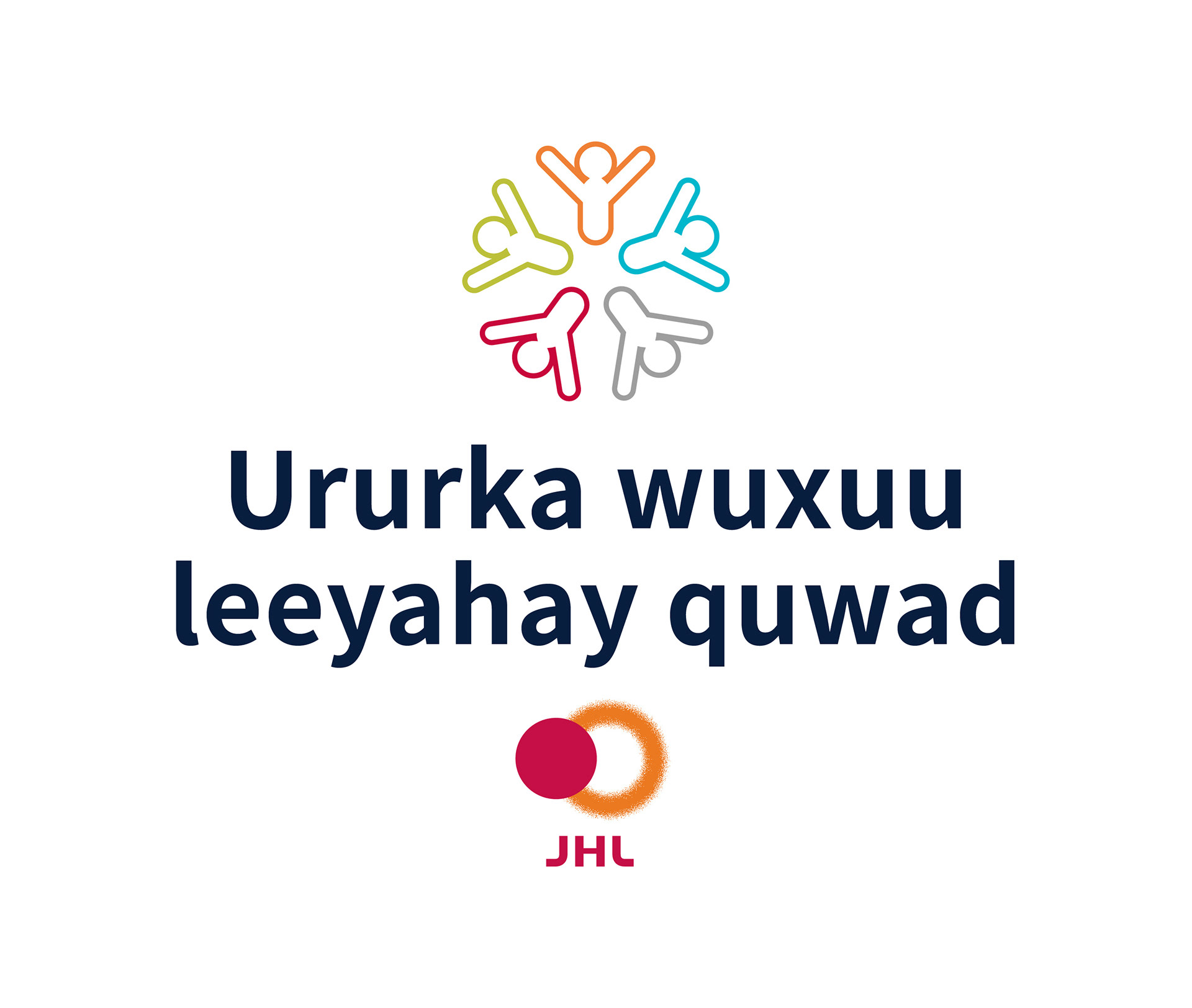
Somali
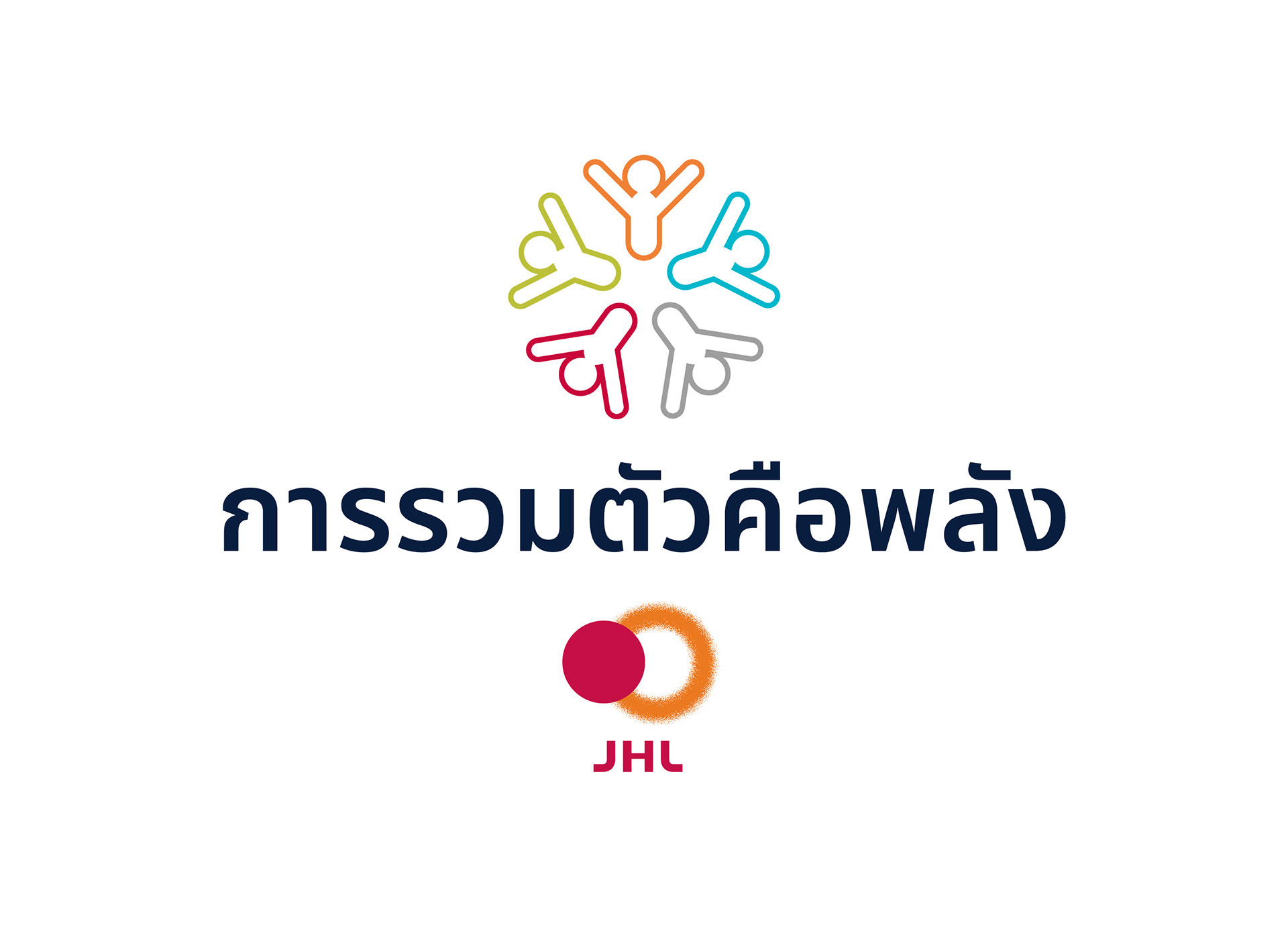
Thai
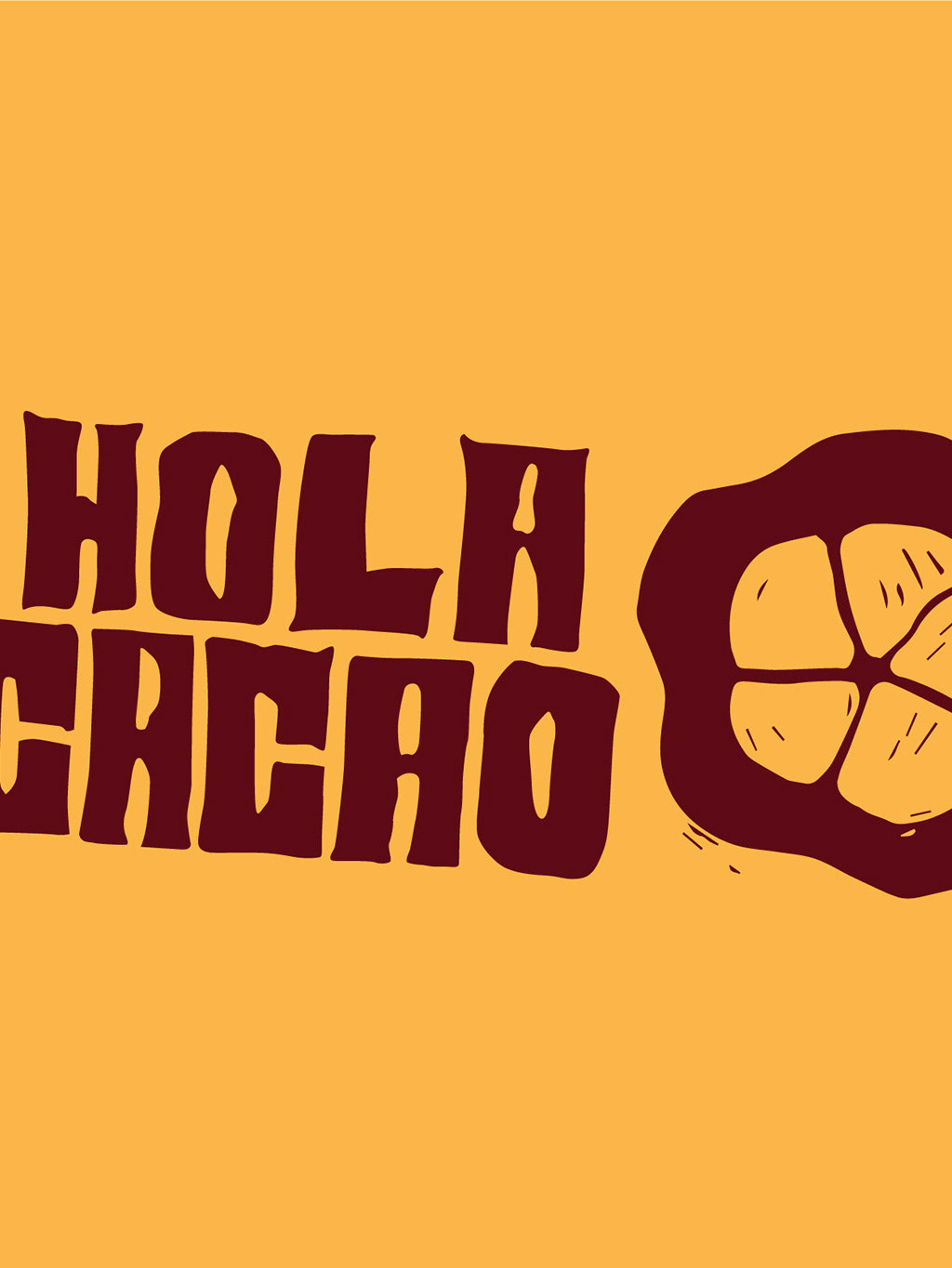
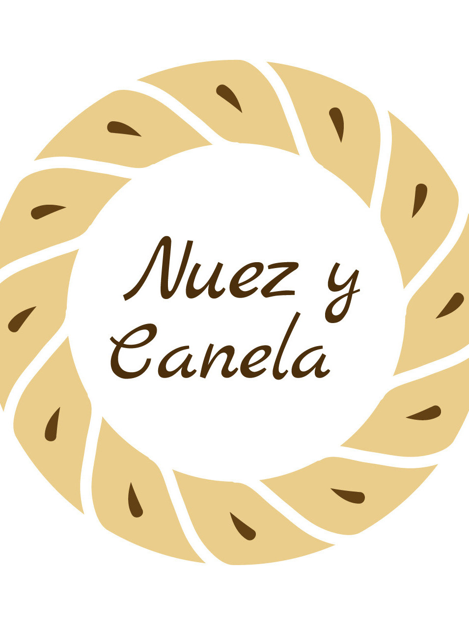
Application to merchandise products.
All printed in Finland using sustainable alternatives: